NK copies NASA with new space agency logo
By Jeong Ji-su
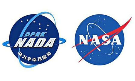
The new logo of North Korea’s new space agency looks so similar to NASA’s, reported the Guardian on Tuesday.
The blue globe, circular ring and the lettering on North Korea’s space agency logo looks a lot like those of NASA.
The Korean Central News Agency explains that the globe means the country’s concept of peaceful exploration, the blue ring for satellites, and the constellation of stars for Kim Il-sung and Kim Jong-il’s determination to show Korea’s space power.
The lettering on the emblem, Nada, is an abbreviated form of North Korea’s National Aerospace Development Administration. As a matter of fact, the word Nada is equivalent to a Spanish word for “nothing.”
According to leading overseas experts, North Korea launched a satellite named “Unha” in 2012 is assumed to be malfunctioning.